Five different kinds of grey
My post from a couple of weeks ago about the changes to this site briefly mentioned that despite having this domain for about five years I’d never been satisfied with its design.
I’ve actually lost count of the number of times I’ve switched themes but, spread across Blogger, WordPress and Tumblr, it must be at least 10. None of them stuck.
Part of that is likely that I never stuck at it, never put in the effort to make the posts worthwhile. But maybe one of the reasons why is because I knew I wasn’t going to be happy with how the results looked.
But I am happy with the design now. Having put in the time to learn HTML and CSS (with some help), it wasn’t too hard to make something that I’m at least a little proud of. And now I’d like to share some of the thinking behind it.
It’s pretty simple — largely because I can handle this kind of simplicity well with my limited skills. But it’s just a personal blog and I don’t want to overcomplicate matters.
I took a lot of cues from Dr Drang, Marco Arment and John Gruber, all of whom have great sites with top work framed with a straightforward design.
I’d love to claim some kind of inspiration but, when it came down to it, I made a fairly arbitrary decision to stick the meta stuff on the left, the content in a big long column on the right and then call it a day. On smaller screens the meta column sits on top of the content and the social links disappear entirely on particularly thin screens (phones) as they’re not essential. My earlier sketches had elements boxed or ruled off, but a few technical difficulties pulling this off convinced me to mostly just use whitespace.
All text is set in Rooney. A while ago I had got obsessed with Tisa and had initially planned to use that. But I eventually had trouble reading long Instapaper articles in it — the vertical strokes tended to run together when I was tired. After searching the Typekit library for a while I settled on Rooney, which is similar in many ways to Tisa — but with enough subtle differences and little quirks to avoid the problem I had with Tisa. Also as lovely as Tisa is it can be a bit cold and clinical, while I find that Rooney feels more warm and welcoming.
Paragraphs are limited to roughly 65 characters (about 12 words) a line, though I’m still tweaking the exact length. I had initially had an idea to accommodate margin notes in the extra space but technical hurdles, a lack of anything to put there and fear of looking incredibly pompous made me decide against it. A remnant of this can be seen in the blockquotes, code blocks and coloured boxes I use, which all stretch the full width of the column. Code blocks are the only element that make use the extra space, but the others get it because I like how their background colours can help break up long columns of text.
The coloured boxes I mentioned above I call “flags” and came about when I decided I wanted a way to flag updates to posts. (Again, an influence of Dr Drang: see the updates in this post.) I then generalised the style to be applicable to a range of things, such as flagging download links and warnings.
The flags use icons from Symbolset’s Standard font, which I use in a few places on the site — probably not enough to justify the weight of an extra web font but I like the font a lot and had been itching to use it for months. Similarly, the social icons in the sidebar use Symbolset’s Social font. I use the circular version to give them an even appearance.
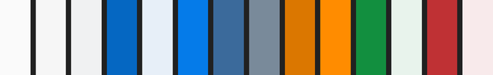
It took me a long time to pick out the dark blue used as the left-hand border of the flag above, which is also the primary link colour. Generally, I’m not great at picking colours but Spectrum helps enormously. Before using Spectrum I’d end up with a murky mess, but now I’m actually very pleased with the palette I have created. It’s mostly blue and grey, with splashes of green and red where appropriate.
The image below shows all the colours used on the site, apart from those used for code. (The two oranges are only used for the RSS link.)
The syntax highlighting for code is another thing I lifted from Dr Drang, which is to say it is highlight.js combined with the Doc’s script to conditionally invoke the highlight functions and add line numbers.
I’ve uploaded my slightly rewritten code as a GitHub gist. The two main changes are the introduction of the module pattern (using the RJW global variable as a container) and removing the dependency on JQuery. The syntax colour scheme is based on my custom one for BBEdit.
Speaking of JQuery, nothing in my design requires it. But it’s one of those things Tumblr injects into your blog anyway. This is a bit of a shame, as I’d tried to keep page weight down (five web font files notwithstanding). The three largest downloads on this page are all things injected by Tumblr — the fourth is my 135KB Typekit CSS file.
While this doesn’t bother me a huge amount, it does add another reason for me to move away from Tumblr — almost certainly to a static system of some kind. (I have a fantasy of learning enough Python to write my own.) While I imagine that’s quite a while off, it should be a fairly easy transition — there are no dynamic elements to move over and the “Tumblrised” HTML file I have would be simple to switch to another template system.
I haven’t spent much time on Tumblr-specific features, either. The only post types I accommodate are text, links and photos. I did the work for the latter two largely because I already have posts of that type that I wish to keep, not because I plan to make more of them in the future. Again, making it easier to switch away at some point in the future.
It’s not that I dislike Tumblr, just that I’m not a great fit for Tumblr and Tumblr’s not a great fit for me and the kind of site that I want to run.
Right, we’re over 1,000 words now so it’s time to wrap it up. If you’ve made it this far, thanks! If you have any comments or questions be sure to send me a message on Twitter or App.net.